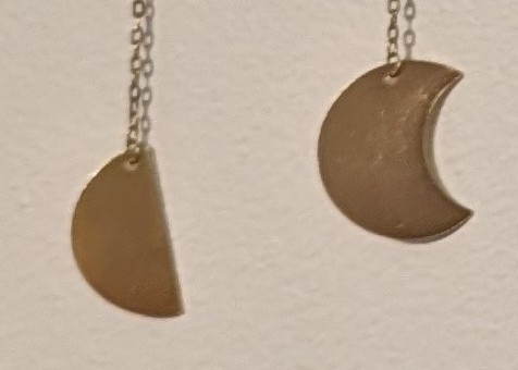
Looks innocuous enough at first glance right? Let’s zoom in on the problem:

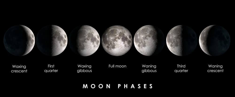
These don’t go together. If the semicircle on the left is correct, then this is showing moon phases, and the symbol on the right should be of a gibbous moon:

If the cookie-with-a-bite-taken-out in the right is correct, then this is showing an eclipse, and the symbol on the left should be of a 50% partial eclipse:

It drives me crazy every time I look at it.
My wife bought a candle with a label stating “I’m glad you’re as weird as me.”
I try to avoid being the grammar police in general, but it’s right in front of where my eyes usually go when I pee, so it’s hard to ignore.
The worst kind of grammar pedant: the one who is passionate about a “rule” that is actually only a style recommendation.
Well, I don’t disagree with you.
I’ve never said anything to my wife about it because I don’t want to ruin whatever enjoyment she gets out of it.
In fact, I’ve never said anything about it outside of my own head (before the above comment) because correcting grammar (or commenting on grammatical style) when the meaning of the statement is clear rarely improves anything or anyone; in this case, I thought it relevant to the conversation, though the court of public opinion appears to disagree.
Ah well.
I don’t know if you realize how condescending it sounds to hear you say you “don’t want to ruin whatever enjoyment she gets out of it” by telling her… what? That you arbitrarily look down on the use of this absolutely grammatical construction?
The thing that bothers me most about stuff like this is that it is effectively some kind of “gotcha” that makes people feel foolish, like their natural, completely grammatical speech has errors, or something they should feel bad about.
well, who really says “I’m glad you’re as weird as I” ? Might not be room for an ‘am’.
I 100% have said that exact sentence and other grammatically similar ones.
I acknowledge, in the spirit of this conversation, that the previous sentence should probably have one to two commas in it. However, I’m not adding them since I’m very tired and the post probably won’t be placed above anyone’s toilet for frequent observation.
I also acknowledge that typing that was probably a lot more effort than adding one to two commas.
I enjoy using semicolons. They’re very useful. I consider them to be a comma-chameleon.
Turn them round.
That’s not the issue. The artist has decided that the cutout is the shadow, and just made ot “move across” the moon. This is now how light hitting the moon looks from Earth.
@agamemnonymous@sh.itjust.works may I suggest pretending you are looking at it from the perspective of an asteroid 30 degrees “above Earth” and circling us. That would make it accurateish.
Everything is perspective.
I’m not sure I understand
He thinks the problem is that they’re in the wrong order when the problem is that they’re the wrong shape.
Although now that I look at it I think the different colors are supposed to represent shadow and moon, not just moon.
Different colors? They’re all monochrome gold, if it looks like different colors that’s just reflections from light in the room
Yeah, I was pondering if it’d be possible to make it less of an issue. I presume the metal of the discs and chain is pretty thin, so you could get to work with tin snips, a file and some needle-nose pliers. Take them off, rework some and hang them back up. However, a) I’m not sure it could be done satisfactorily and b) that sounds like a lot of hassle for some, hopefully, cheap knickknack, so I’d probably just make it have an accident.
They seem like cheap plated metal, any alterations are going to wind up flaking and looking terrible
Accident it is then.
Bright eyes 🎶
EVERY NOW AND THEN I GOTTA FART
Clearly this is depicting one of those super rare eclpses where a much larger faster object trsverses the plane halfway through, then the remaining eclipse continues.
I see the problem, but I doubt many would. No easy fix, but you could go two directions. Replace the one wrong shape and rearrange them, or just replace one of the open circles with a solid and rearrange them to represent an eclipse (with solid on the outside, hollow in the middle.
I get how an astronomy fan would get annoyed. I’ve gotten gifts before that have had a slight inaccuracy to it, so small I didn’t even catch it the first time I saw it. And now I can’t unsee it. I still appreciated them though. And yes, I had in a few instances considered if I could fix the issue, but sometimes it’s better to just accept it as is. Nothing is perfect, after all.
Eclipses do not have a semicircular phase. It’s wrong as lunar phases, and it’s wrong as an ecliptic transit.
Would changing its name to “eclipse decoration” make it less infuriating?
Considering that semi-circles are not part of an eclipse, no.
Then the half eclipse would be wrong, 50% eclipse wouldn’t be a straight line across the diameter. An eclipse is two circles intersecting, not shadow sweeping across a sphere.
OP must be either autistic or an astrophysicist. Just chill out dude. Take your meds or smoke some weed, whatever it takes.
Eh, there’s a reason that Mildly infuriating exists as a community — sometimes the best way to exorcise one’s aggravation is to give space to the annoyance by sharing it with other persnickety people.
Right, I forgot that autistic people are not allowed to post about things that annoy them in a community about annoying things. Noted.
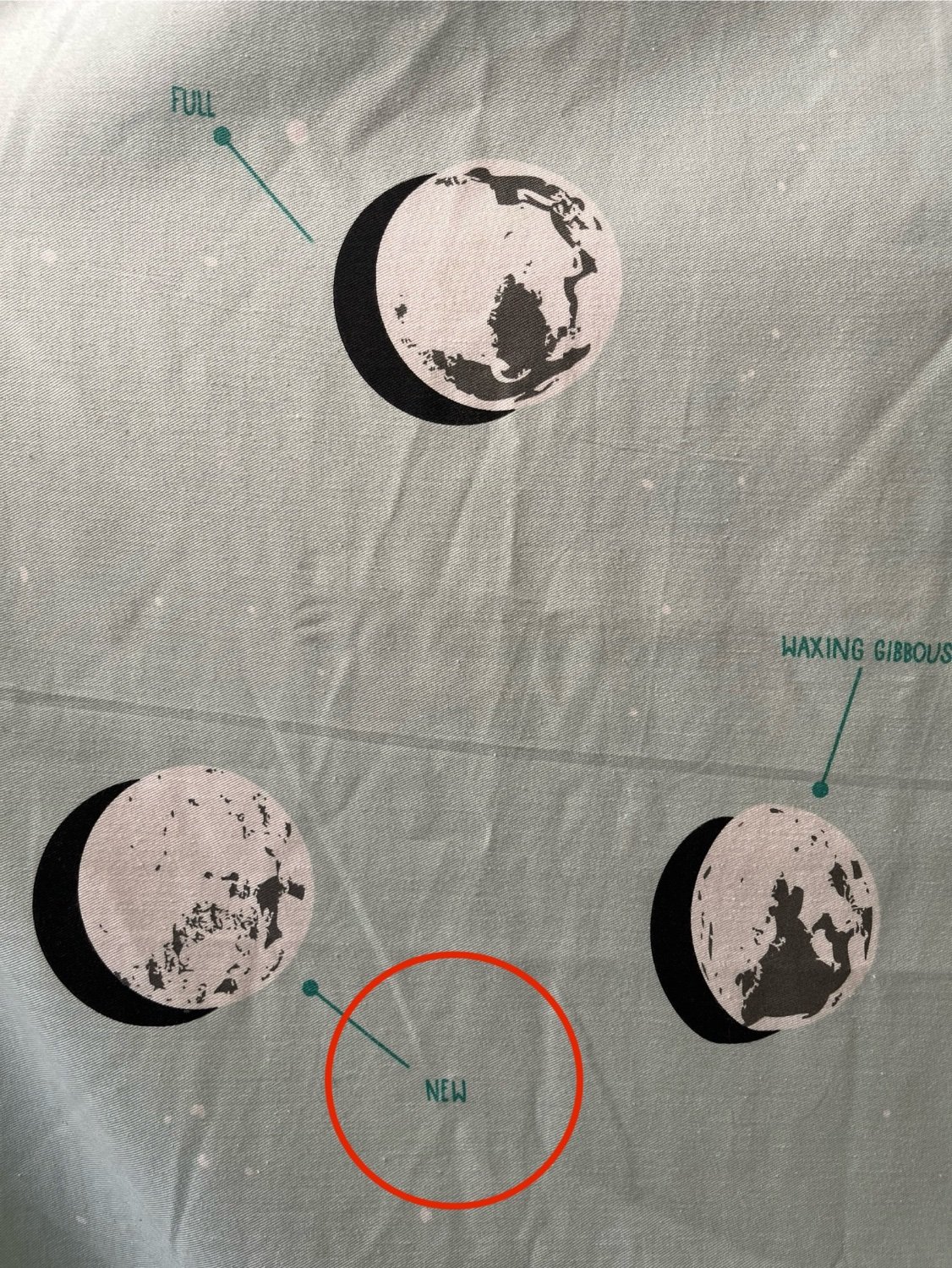
As I’m reading this I’m sitting in my bathroom staring at the shower curtain my wife picked out which has an equally infuriating moon illustration…

Why on earth would they add a drop shadow while also having a semi white background? I want to find the original designer and squeeze a tube of super glue up their nostrils
Clearly this is from the point of view of a planet with 13 separate individual moons, 11 of which are experiencing an eclipse just at the moment.
I mean without the quarter moons it works for an eclipse… kinda… just gotta reverse the order on everything starting from the middle? and replace one of the hollows (eclipses/news) with another one of the fulls?
If you are concerned more with how the jewelry looks, I honestly like how it’s made better. more metal in the center. but I am with you on “it should be right I do not like that it is wrong” and I’d love if they had both options.
If the wife likes it, mission accomplished!
Just take a chill pill man.
My wife had a very stressful and demanding job that paid well. I sacrificed my career advancement so she could pursue this dream. After a few years she burned out, was miserable, and wanted to quit to find a new job. However this came with a huge pay cut too which made the decision more difficult and I was (hopefully understandably) frustrated because I had made all of these sacrifices so she could follow her dream.
But I wanted her to be happy so we figured it out.
Moral of this story? Since then I’ve learned how much truth there is to the “happy wife, happy life” idiom.
How right, I should limit my neurotic nitpicking to appropriate spaces.


