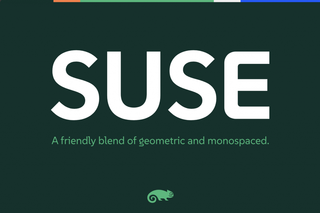
SUSE just open-sourced a typeface :)
no dotted zeroes = no terminal use
I don’t think this font was designed for the terminal. It’s a sans font with some inspiration from monospace styling, but with focus of brand recognition and usage in headlines or text. That’s what I’m getting here. Similar to what Ubuntu does with their font.
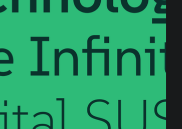
I’m not a fan of the way the lowercase L’s tail interacts with uppercase letters, but other than that it’s not bad!
The “fi” combination also seems problematic since they seem to intersect.

That’s a ligature, it’s deliberate.
To me, that’s even worse. Ligatures that have 0 separation where it’s expected short circuit my reading comprehension.

You can turn them off with every font. But you’ll be surprised by how much they can improve readability, because they remove optical irritation as shown here.
So what I see there is that badly designed fonts require ligatures to correct interactions.
Like, I get that there are some neat ones, e.g. I have them turned on when writing code for symbols, but they seem wholly unnecessary and distracting in alphabetical characters.
But I’m also the kind of weirdo that thinks the world needs more monospace fonts.
/shrug
It is the exact opposite. Ligatures were created to help deal with the lack of clarity when symbols overlap. fi, ff, fl, ffi, have historically (like print press historical) been common ligatures where others are stylistic, where others are downright questionable & make things harder to read. The first category should almost always be supported, & the others can usually be disabled if not commonly off by default where you opt in for some design, not for general body copy.
What you are referring to about ‘programming ligatures’ is an outright abuse of open type features full of false positives, ambiguities, & lack of clarity for outsiders to understand what your code means. What you want is Unicode supported in your language so you can precisely what you mean than using ASCII abominations—like meaning
→but typing->, dash + greater, than which isn’t at all what you mean which is a rightward arrow. (with a non-exhaustive languages with decent Unicode support: Raku, Julia, Agda, PureScript, Haskell with Unicode pragma, & all APL dialects).
But does it have unicode emojis?
😀 😁 😂 😃 😄 😅 😆 😇 😈 🕧 🕯️ 🕰️ 🕳️ 🕴️ 🕵️ 🕶️ 🕷️ 🕸️ 🕹️ 🕺 🖇️ 🖊️ 🖋️ 🖌️ 🖍️ 🖐️ 🖕 🖖 🖤 🖥️ 🖨️ 🖱️ 🖲️ 🖼️ 🗂️ 🗃️ 🗄️ 🗑️ 🗒️ 🗓️ 🗜️ 🗝️ 🗞️ 🗡️ 🗣️ 🗨️ 🗯️ 🗳️ 🗺️ 🗻 🗼 🗽 🗾 🗿
Hmm it specifically seems to be missing emojis
It’s a latin font.
Designing all unicode characters would be madness.
i fw it
What does this means?
@P4ulin_Kbana @potentiallynotfelix fw = fuck with. It means they like it.
What is going on with that lowercase g?
That’s fairly standard for serif fonts like times new roman, baskerville, etc. Although it is uncommon in modern sans serif fonts and/or fonts designed to be viewed on a screen.
I need more discussion on typefaces. Typography is one of my hyperfixations. :-)
P.S.: I meant “special interests”, not hyperfixations.


